Rethinking requirements to remove complexity and friction from the user experience
Overview
- Summary
- Through critical thinking, I foresaw problems with the original requirements for locking cases and designed a different solution that reduced complexity whilst still solving the problem.
- Product
- Case Management System
- My role
- Lead Designer
- Year
- 2024
Note: this case study covers 1 feature of a 20-month programme. For more background and context on the project, see the project overview.
Problem definition
Handling case ownership to prevent users from working the same cases
One of the problems we needed to solve as we digitalised the team's process was case ownership. Currently, when an officer was working a case, the physical paper file would be on their desk and therefore nobody else could work on it. In the new, browser-based system, it would be possible for users to work a case at the same time.
We needed a way to prevent users inadvertently double-handling cases.

Requirements
The original requirements: locking cases
The original requirements suggested a need to 'lock' cases so that only the currently-assigned user had edit permissions. This would prevent users mistakenly working on the same cases.
The task assigned to me was to design the UI and process around locking and unlocking cases.
Critical thinking
Working through the problem
I was hesitant about the concept of locking cases to single users as it felt heavy-handed and seemed likely to introduce friction to the user experience.
One of the key goals of the product was to increase team efficiency and I could see scenarios where locking cases could create a roadblock.
I started thinking through the problem and drafted some questions:
- Are there other reasons that cases need to be locked to single users? e.g. Security or privacy considerations
- Are there scenarios where multiple users would work together on the same case?
- Are there scenarios where multiple users would need to perform separate tasks on the same case?
- Are there scenarios where users would need to pause a task halfway through?
- What is the current procedure if a user is unable to complete a task? e.g. Going home sick.
- Who should have permissions to unlock cases?
- Should users without permissions be able to send 'unlock requests'?
Research
Getting answers to my questions
I brought my questions to the project team first. I shared my concerns about the 'locking' solution and asked our Business Analysts and User Researcher whether they had any insights. We decided to bring the questions to the Product Owners at the next weekly checkpoint.
As we worked through the questions with the Product Owners we gained better clarity and understanding of their current processes and the underlying requirements for this feature:
- All staff held the same level of security clearance so there were no security or privacy reasons to lock cases.
- They were keen to promote trust and openness within the team.
- If cases were locked, Duty Managers would be the only users who should be able to unlock them. However, Duty Managers were stretched thin and the Product Owners were keen to avoid additional admin where possible.
- Although they try to avoid it, there are a number of reasons that a Duty Manager would need a caseworker to change task onto something urgent.
- If a member of staff goes home sick, their active cases are passed to another caseworker to complete.
- There were a number of scenarios were a caseworker would need to edit a case being worked on by someone else.
Hypothesis
If the UI was clear, users wouldn't work the same cases
Following the additional insight gained from the Product Owners, I thought the requirements could be met without introducing the complexity of locking and unlocking cases.
My hypothesis was that if the UI made it clear that a case was actively being worked on by another caseworker, then users would only try to edit that case for legitimate reasons.
Design
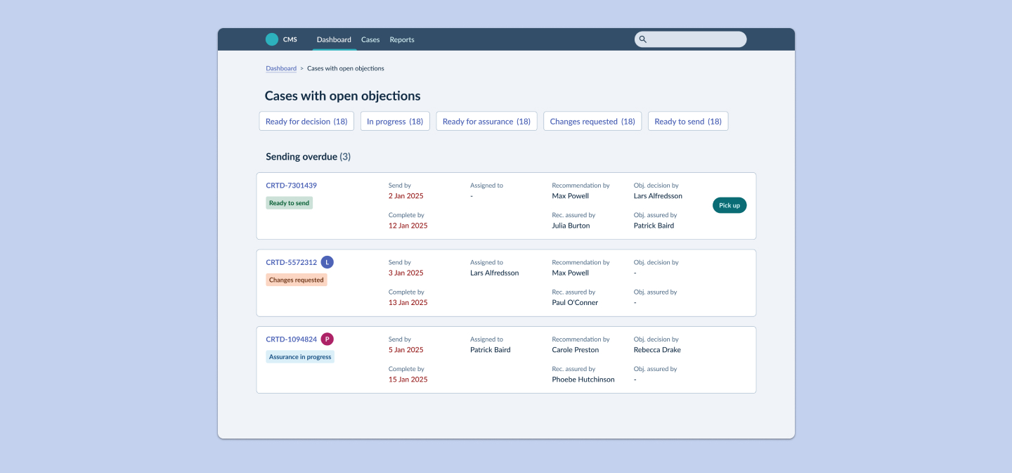
Making a clear distinction between available and unavailable cases
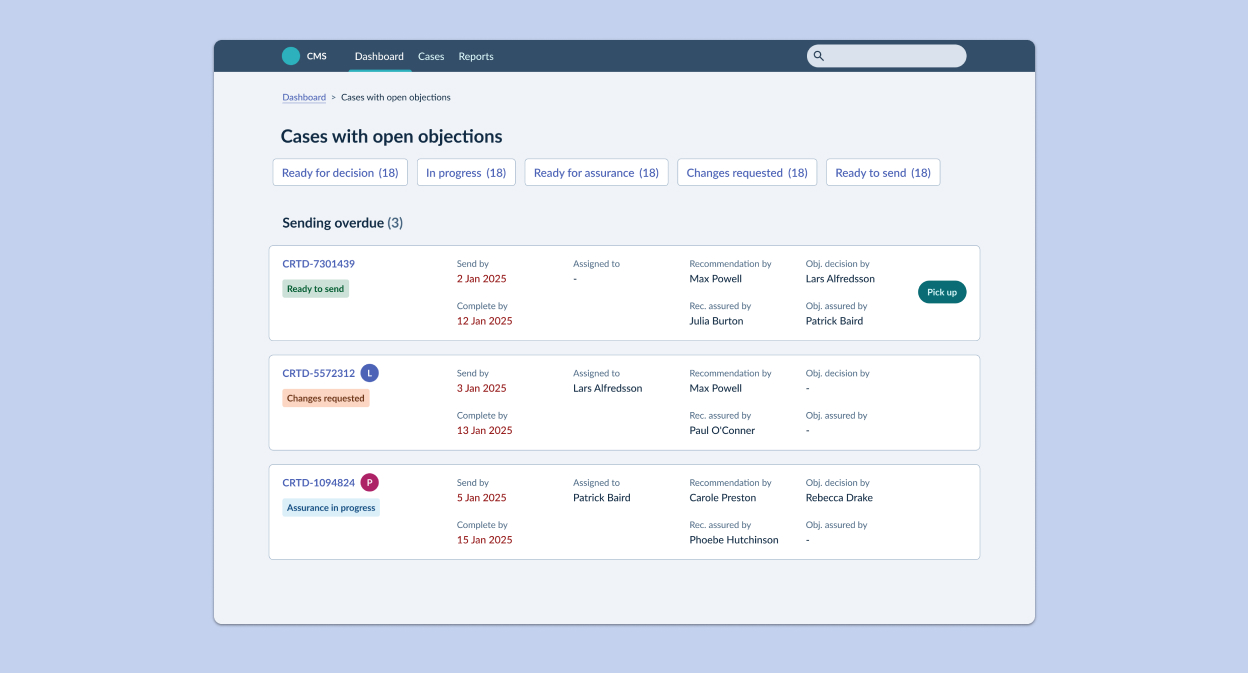
I proposed a number of solutions that could combine to solve to the problem:
- Adding an 'Assigned to' field to the case.
- Adding a new status to the workflow for 'In progress'. This would then enable filtering on the dashboards.
- A clear action button that would enable users to assign themselves to a case.
- The absence of the button on some cases would hint that the case was not available to be worked on.
- Introducing user avatars that would display when a user was currently viewing a case.
I knew that web sockets were being introduced for a different purpose elsewhere in the product so the same technology could be reused for the 'Currently viewing' feature.
Evaluation
Testing the designs with users
We needed to understand how users would respond to what they saw on screen so I decided there was no need to build a highly-interactive prototype for this test.
I developed a lightweight Figma prototype that enabled us to test the designs and gather critical user feedback before development. We gained some key insights from the initial tests:
Iteration
Refining the design following feedback
I made one small revision to the design following the user testing. The avatar feature was removed as feedback had shown that the other solutions were more than sufficient to solve the problem. Web sockets had also been descoped from the other feature so all-in-all it made sense to remove it.
Impact
Critical thinking led to a simpler design
By applying some critical thinking and going back to work through the requirements with the Product Owners, I was able to design a solution that was simple and effective.
My solution:
- Saved development time
- Fit with existing patterns
- Removed complexity
- Removed friction
- Removed unnecessary admin from Duty Managers
- Provided more flexibility
- Solved the problem
More from this project
Other projects
Increasing conversion rate for new policy sign-ups
How I tackled a customer acquisition problem with a redesigned journey that reduced time on task and maximised conversions.
View case study
Contact
Give me some new problems to solve
An experienced Product Designer looking for a remote full-time position that will bring new challenges and opportunity for growth.
Send me an email(opens mail client)