Increasing conversion rate for new policy sign-ups
Overview
- Summary
- Over 95% of customer acquisition for 4Paws Pet Insurance happens through their website. I was tasked with optimising the new policy workflow from initial quote through to final payment.
- My role
- UX/UI Designer
- Year
- 2021
- Team
- Account Director
PPC Executive - Timeline
- 6-8 weeks
Problem definition
A high dropout rate throughout the funnel resulting in a high cost per acquisition
4Paws originally engaged the agency with the goal of optimising their pay-per-click advertising to drive direct traffic rather than referrals from aggregator websites.
Our PPC Executive had improved their campaigns and increased direct website traffic. However, overall cost per acquisition remained high as only a small percentage of traffic was converting to the sale of a new policy.
Analytics data showed that there was a low conversion rate across all channels. I was tasked with reviewing the end-to-end website journey to decrease drop-offs at each stage.
Success metrics
Agreeing the objectives and how success would be measured
Before starting any work, we workshopped specific objectives with the client and collectively agreed what success would look like for the project. We set measurable* objectives for:
-
 Increased conversions
-
 Decreased drop‑offs
-
Decreased time on task
-
Decreased cost per acquisition
* Specific targets are company confidential and have been omitted.
Constraints
Key challenges that informed my approach
Limited time and budget
The client had to find additional funding as this work wasn’t planned for in their original marketing budget. This meant I had limited budget to work with.
No access to real users
Any engagement with users would require starting from scratch with recruitment as there wasn’t an existing pool of users that could be recruited from.
Accelerators
What we had going for us
We had data
There was an established Google Analytics setup which provided a rich set of tracking data through the funnel.
HotJar had been running on the site for a while so there were plenty of session recordings to provide insights.
Strategy
Key principles I set to guide my design thinking
Design for performance
The primary objective for this piece of work was to move the needle on the agreed business metrics. This guided decision making during ideation and designs.
Keep it lean
Budget was tight. I needed to ensure that my approach maximised the time and resources available. Each stage of the process needed to cover ‘just enough’ to be able to move forward.
Bring everything back to metrics
The client was laser-focused on ROI. All recommendations and outputs from this project needed to clearly evidence how they would impact the key success metrics.
Research
Assessing the existing design
I started by analysing all existing data points to gain insight into where the current design had problems. This insight came from 3 sources:
Google Analytics
I create a conversion funnel in Google Analytics to determine user drop-off rates at each step of the process.
HotJar recordings
User recordings provided insight into user behaviour as they moved through the workflow and highlighted key pain points that were causing confusion and frustration.
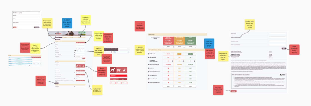
Heuristic evaluation
I conducted my own evaluation of the interface to identify potential usability problems.
Analysis
Synthesising the research and drawing conclusions
I created a Mural board to collect my observations as I completed my assessment. This enabled me to synthesise all my findings and determine where my evaluation (yellow stickies) was supported by data in HotJar (red stickies) or Analytics (blue stickies).
Ideation
Exploring design options
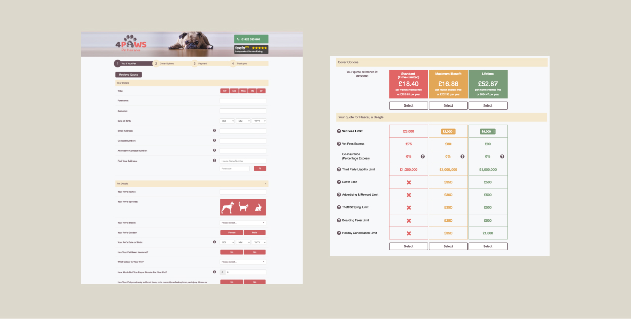
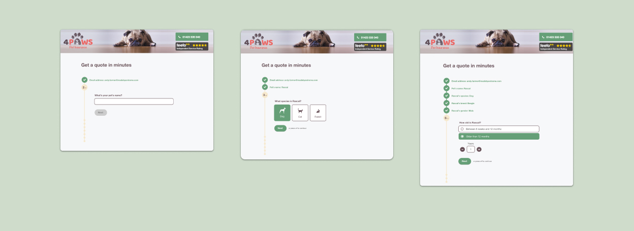
Concept A: Optimising changes only
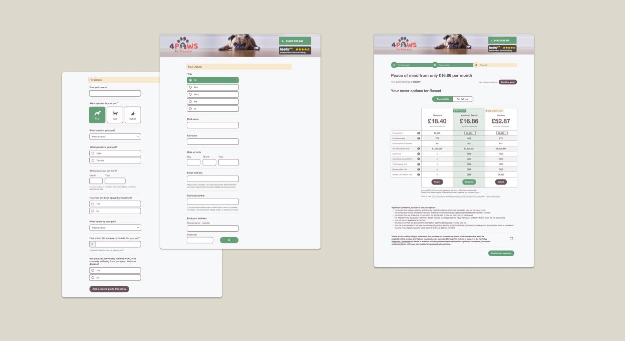
Concept A gets the job done. This design focused on addressing the priority usability issues but didn’t try to reinvent how the pages function. The visual design was also kept very close to the original, except where this caused issues (for example, changing the heavy of use of red). This concept didn’t change any of the content of the form.
Concept A was the simplest and would involve the lowest dev effort, but would still deliver results.
Concept B: Quick quote
Concept B built upon Concept A but focused on making the quote form shorter. I reviewed the questions on the form and removed any that didn’t have a direct influence on policy price. Moving the additional fields to later in the journey reduced the time to get a quote and enabled users to see prices sooner.
It also experimented with ways to make the form feel shorter, utilising well-research and established approaches such as one thing per page.
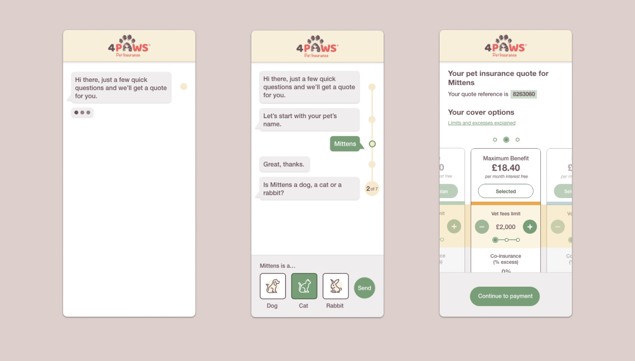
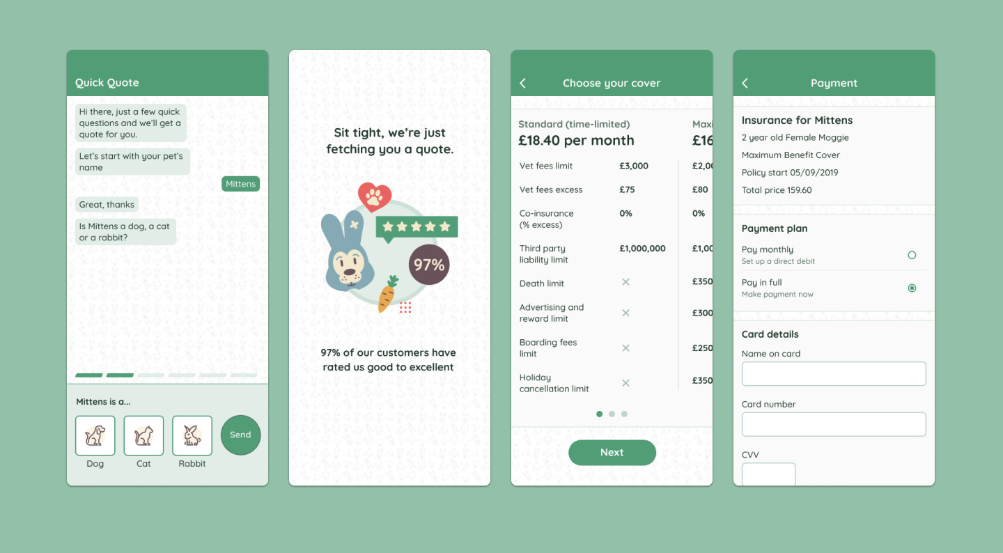
Concept C: Friendly chat interface
For Concept C I explored a different approach for the initial data capture part of the flow. I introduced a chat interface to make the process feel more personable and bring a friendlier tone to the design.
This concept also helped to break the process down into smaller steps in order to feel shorter and less effort.
Concept D: Chat interface with a glow up
The first 3 concepts kept the visual styling inline with what 4Paws already had in place. For Concept D I decided to explore how the visual design of the UI might be improved to feel more modern and professional but still in-keeping with the brand.
Feedback
What senior leadership said
After presenting to the client project team, I was asked to present the concepts to the Senior Leadership Team for feedback.
I facilitated a workshop where we discussed each concept in a lightweight design critique format.
Overall the feedback on the project was overwhelmingly positive. Several members of the SLT strongly backed Concept D and it was collectively decided that this was the design to move forward with.
Impact
The results are in
Concept D was developed and then A/B tested against the existing design. There was a significant improvement in all target metrics*.
-
Increased conversions
-
Decreased drop‑offs
-
Decreased time on task
-
Decreased cost per acquisition
* Specific results are considered company confidential and I’ve not been permitted to publish.
Reflection
What I would like to have done differently
Concept testing
While Concept D performed well and was a huge improvement, it was only tested against the current design. My expectation following initial concept development was that multiple concepts would be prototyped, tested and iterated upon.
Introducing some concept testing at this stage would have significantly reduced the risk being carried into development and would’ve enabled us to make a decision based on data to achieve the best outcome.
Other projects
0 to 1 design of large, complex internal system
How I designed a Case Management System that would provide reusable capabilities and could be easily scaled across multiple business areas.
Read project overview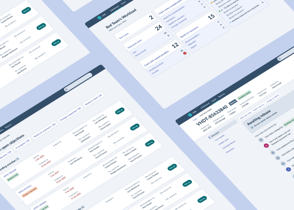
Contact
Give me some new problems to solve
An experienced Product Designer looking for a remote full-time position that will bring new challenges and opportunity for growth.
Send me an email(opens mail client)