Boosting team efficiency with workload dashboards
Overview
- Summary
- Operational dashboards that enabled caseworkers to manage their workload and provided management with actionable insights to inform resource decisions.
- Product
- Case Management System
- My role
- Lead Designer
- Year
- 2023
Note: this case study covers 1 feature of a 20-month programme. For more background and context on the project, see the project overview.
Objective
Provide users with accurate information to support the day-to-day operations of the team
The dashboard screen would be the main landing page for the system. It needed to be a navigational hub and provide insight into current workload across the team.
Dashboards also needed to provide a snaphot of the "current state of play" to enable management decisions.
As-is
Paper-based processes and grey IT
Our site visits gave us first-hand experience of the team's current operational processes. This involved paper files and legacy IT systems including Access databases and spreadsheets.
The office had full-height wall-to-wall shelving full of orange paper files. Each file was a case in progress needing to be worked to completion. The shelving was divided into sections with each shelf labelled with a case status.

These shelves were how the team tracked current workload. Eye-balling a particular section gave an estimate of how many cases were at that stage of the workflow.
An Access database provided more accurate reporting, but this was a time-consuming task that had to be run manually and only provided a shallow amount of information.
The team also supplemented the process with a number of spreadsheets that tracked cases at critical phases of the workflow. These relied on staff to keep them up-to-date and accurate.
Pain points
Lack of operational oversight
The biggest pain points were a lack of operational oversight and reliance on manual processes. This also led to additional challenges:
- It was difficult to prioritise workload
- It was difficult for managers to make resource decisions
- Little visibility of time-bound tasks meant cases could miss legislative deadlines
- Missed legislative deadlines resulted in cases being cancelled
- Each cancelled case was a missed revenue opportunity
User needs
Meeting the needs of two key user groups
Our initial user research identified two user groups that the Dashboards feature needed to take into consideration. Their high-level needs were as follows:
As a duty manager, I need:
- To see up-to-date total counts of cases at each stage in the workflow so that I can assign rota duties
- Visibility of cases with approaching deadlines so that I can ensure appropriate resource is assigned
As a caseworker, I need:
- To find a list of cases based on the rota duty I've been assigned
- For the list of cases to be in date order so that I can select the case of highest priority
- To determine which cases are already in progress so that I can select an available case
- To select an available case to work on
- For my colleagues and manager to know which case(s) I am working on
Scope
What dashboards did not need to do
We also spent time defining the "non-goals" of this feature as it was important to stay focused on the objective. The dashboard feature did not need to:
- Track change over time; it would only show current, up-to-date information
- Track team performance
- Provide reporting information or trend analysis
These requirements would be met by other areas of the system.
Strategy
Design the pattern
The dashboards needed to work across multiple business areas so I considered how they could be generated programatically through low-code configuration. It was particularly important for this feature to follow one of the project key principles: Design the pattern.
Design
First design iteration
I started by exploring some concepts and arrived at an initial layout fairly quickly. I then focused on designing the generic pattern for each dashboard panel. Each panel was designed for a specific use case.
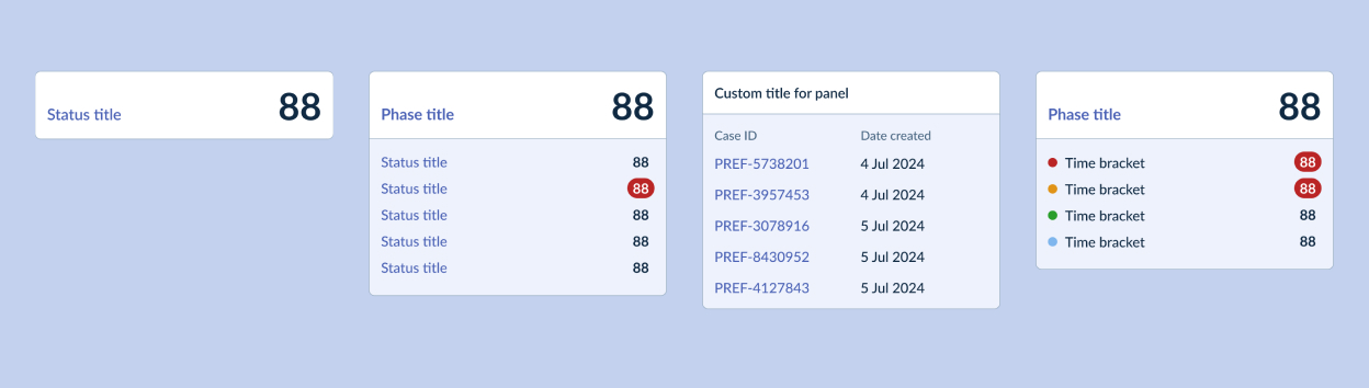
Once the generic components were designed, I brought them back into the layout and configured them for the specific use cases of one department.
Concept testing
Testing the designs with users
I built an interactive prototype of the dashboard using Figma. This allowed us to test with users early and gain critical feedback.
The dashboard feature was tested throughout the project as it was where we started most concept test scenarios. This meant that we were able to refine the design through constant iteration.
“My team have been so involved in the design and development. We can really see how it's going to simplify so much of what we do and allow us to focus on the tasks that staff actually get more value from delivering.”
Insights
Insights from user testing
There were lots of learnings from the early concept tests, some of the key insights we gathered were:
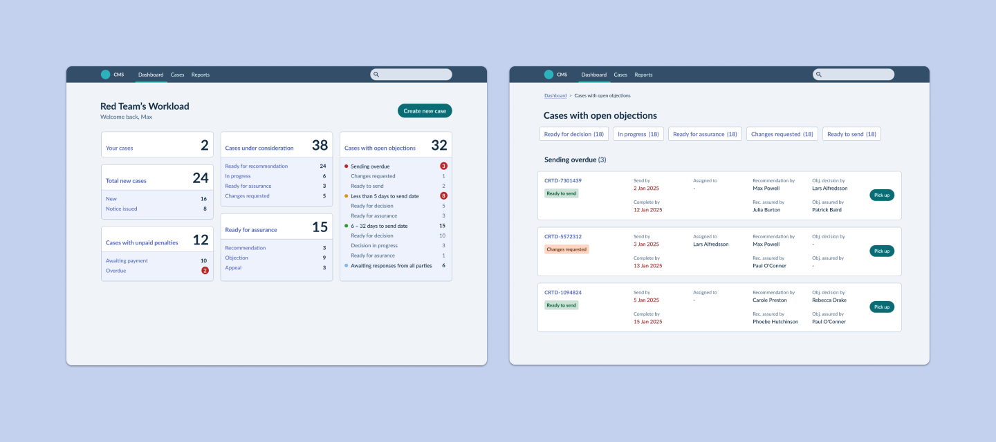
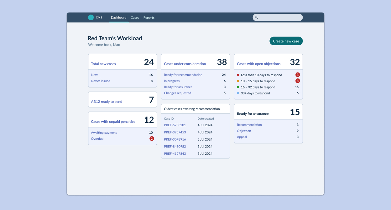
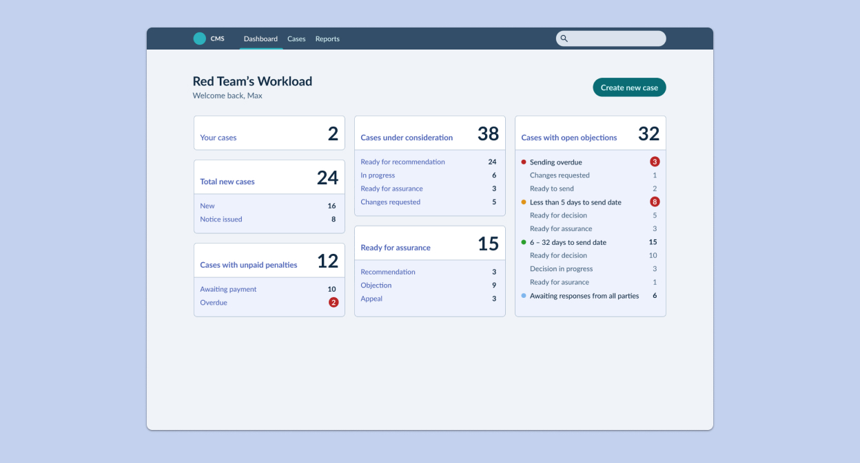
Dashboard view
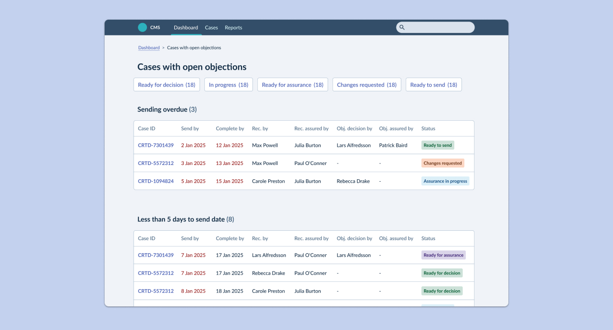
Listing view
Iterate
Continuous iteration and refinement
Over the course of the project, the dashboard design went through a series of iterations before we arrived at a design that we were comfortable to take forward to a pilot.
Key changes made to the dashboard
- Added status counts to time-bound panel to provide additional insight
- Removed 'case list' panel
- Added 'Your cases' panel (an additional requirement that came later in the project)
- Content changes to simplify language and use plain English
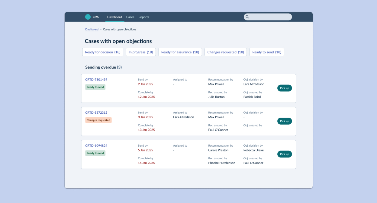
Key changes made to the dashboard listing
- Changed from a table to a card-based layout to reduce the density of the information displayed
- Updated the case information following further input from users
- Reduced the size of the filter navigation
- Introduced 'Pick up' action (read the case study)
Impact
Increased efficiency and clear oversight of team workload that empowered decision making
Further testing of the Dashboards proved that they were successful in meeting the needs of both user groups and we received some excellent feedback.
“This is exactly what we need.”
The dashboard feature enabled caseworkers to quickly and easily find cases to work on. Management were provided with the oversight needed to make resource decisions and to keep track of cases. This significantly reduced the number of cases that missed statutory deadlines and more revenue was generated as a result.
More from this project
Other projects
Increasing conversion rate for new policy sign-ups
How I tackled a customer acquisition problem with a redesigned journey that reduced time on task and maximised conversions.
View case study
Contact
Give me some new problems to solve
An experienced Product Designer looking for a remote full-time position that will bring new challenges and opportunity for growth.
Send me an email(opens mail client)